Tina: A Bold Display Font That Commands Attention Online
It started with a hero section. I was redesigning a boutique coaching website—clean aesthetic, warm tones, intentional whitespace—and the headline just felt… quiet. Too safe. So I swapped in Tina, typed “Your Next Chapter Starts Here,” and hit preview. Instantly, the page exhaled. Not louder—but bolder, more human, unmistakably *intentional*. That’s when I knew Tina wasn’t just another decorative font. It’s a digital presence amplifier.
What Tina Brings to the Screen (Beyond Pretty Letters)
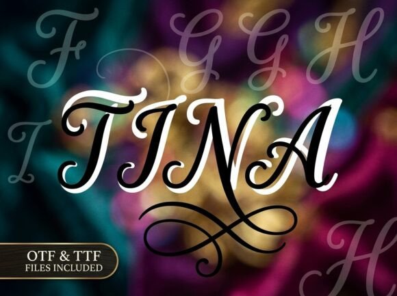
Tina is a premium display font built for impact—not decoration for decoration’s sake. Its strong visual personality comes from confident strokes, subtle organic irregularities, and carefully balanced negative space. It’s not overly ornate, but it’s never neutral. Think of it as the kind of typeface that walks into a room and makes people pause—not because it shouts, but because it carries weight and warmth in equal measure.
I tested Tina across real web contexts: a product landing page for a ceramic studio, a course sales page for a mindful productivity coach, and the homepage banner of a small creative agency. In each case, Tina anchored the message without competing with imagery or layout. It held up beautifully over textured photo backgrounds, stayed legible on light and dark modes, and scaled gracefully from desktop headlines down to tablet-sized hero text.
Where Tina Shines (and Where to Pause)
Tina excels where clarity meets character:
- Hero headlines and section titles — especially on portfolio sites, service pages, or brand storytelling sections
- Call-to-action buttons — when styled with generous padding and contrast, its confident shape adds gravitas to “Get Started” or “Join the Waitlist”
- Logo lockups and wordmarks — particularly for creative, wellness, or artisan brands that want typographic distinction
- Digital brand kits — as the primary display face paired with a clean sans serif for body copy
- Landing page banners and campaign microsites — where first impressions drive engagement and scroll depth
But here’s what I learned the hard way: Tina isn’t meant for everything. I tried using it for navigation labels on a mobile menu—too tight, too expressive for quick scanning. Same with form field placeholders or dense pricing tables. Its charm lies in brevity and intention. Use it for short, meaningful phrases—names, values, promises—not explanations. For accessibility and usability, always pair it with a highly legible, WCAG-compliant sans serif like Inter, Poppins, or even system fonts for body text, captions, and interface elements.
Responsive Behavior: How Tina Performs Across Devices
One of my favorite tests was checking Tina on a range of viewports. On desktop, its full character shines—especially with OpenType features like stylistic alternates enabled. On tablets, it remained authoritative at 48px and above. On mobile? I dropped it to 36px with increased letter-spacing (+0.5px), added subtle text-shadow for contrast over images, and kept line height generous (1.3). It worked—no clipping, no awkward kerning traps, no rendering hiccups in Chrome or Safari.
Pro tip: If your project uses webfonts, confirm Tina includes WOFF2 files and has a well-structured CSS fallback stack. I loaded it via self-hosting (not Google Fonts) and used @font-face with font-display: swap—ensuring fast loading without invisible text. Also worth checking: does Tina include a bold weight? A lighter variant? For most web use, one solid weight (regular or medium) is enough—but having a true bold helps create hierarchy without switching families.
Pairing Tina Thoughtfully (No Guesswork Needed)
Font pairing isn’t magic—it’s rhythm. Tina’s artistic confidence means it needs grounding. My go-to pairing is a friendly, airy sans serif: something like Inter or Manrope for body copy, subheadings, and UI labels. The contrast works because Tina leads with expression while the sans provides clarity and breath. For editorial-style sites (think blogs or digital magazines), I’ve paired Tina with a gentle serif like Playfair Display—but only for H1s and pull quotes, never body text.
Avoid pairing Tina with other decorative fonts—even elegant scripts or modern serifs. It doesn’t need competition. And skip ultra-thin or ultra-condensed sans serifs; they feel disconnected rather than complementary. When in doubt, test at actual size in your layout—not just in Figma or Illustrator previews.
Before You Launch: Licensing, Formats & Practical Checks
Tina is a commercial font, and that matters deeply for client work and live sites. Before dropping it into a Shopify theme or a SaaS dashboard, verify the license covers web embedding and number of domains. Most reputable vendors include WOFF2, WOFF, and sometimes variable font options—check that. Also scan for multilingual support if your audience spans languages beyond English; Tina’s base character set covers Latin-1 well, but double-check diacritics if you serve French, Spanish, or Eastern European users.
Finally, inspect what’s included: stylistic alternates, ligatures, swashes, and figure sets. These aren’t just flourishes—they’re tools. A single alternate capital can elevate a logo; a discretionary ligature might polish a tagline. But don’t enable them globally—apply selectively, where they enhance meaning or mood.
Tina won’t fix weak copy or muddy branding. But in the right context—with thoughtful sizing, smart pairing, and purposeful placement—it transforms how users *feel* about your site before they even read a word. It’s the kind of display font that reminds us typography isn’t just functional. It’s emotional infrastructure.